AT&T + HBO MAX
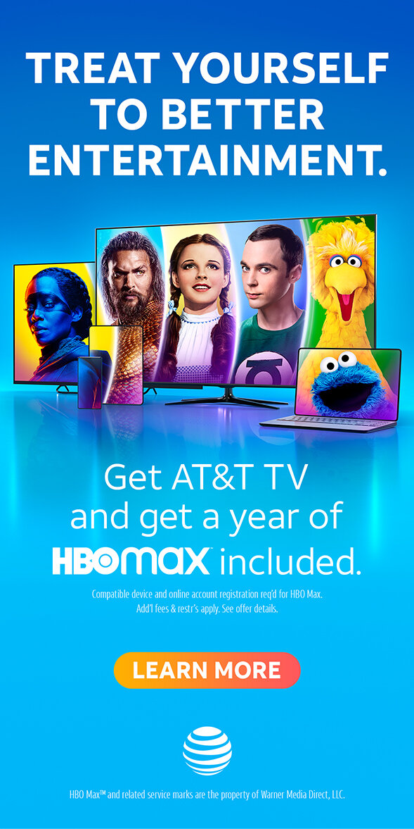
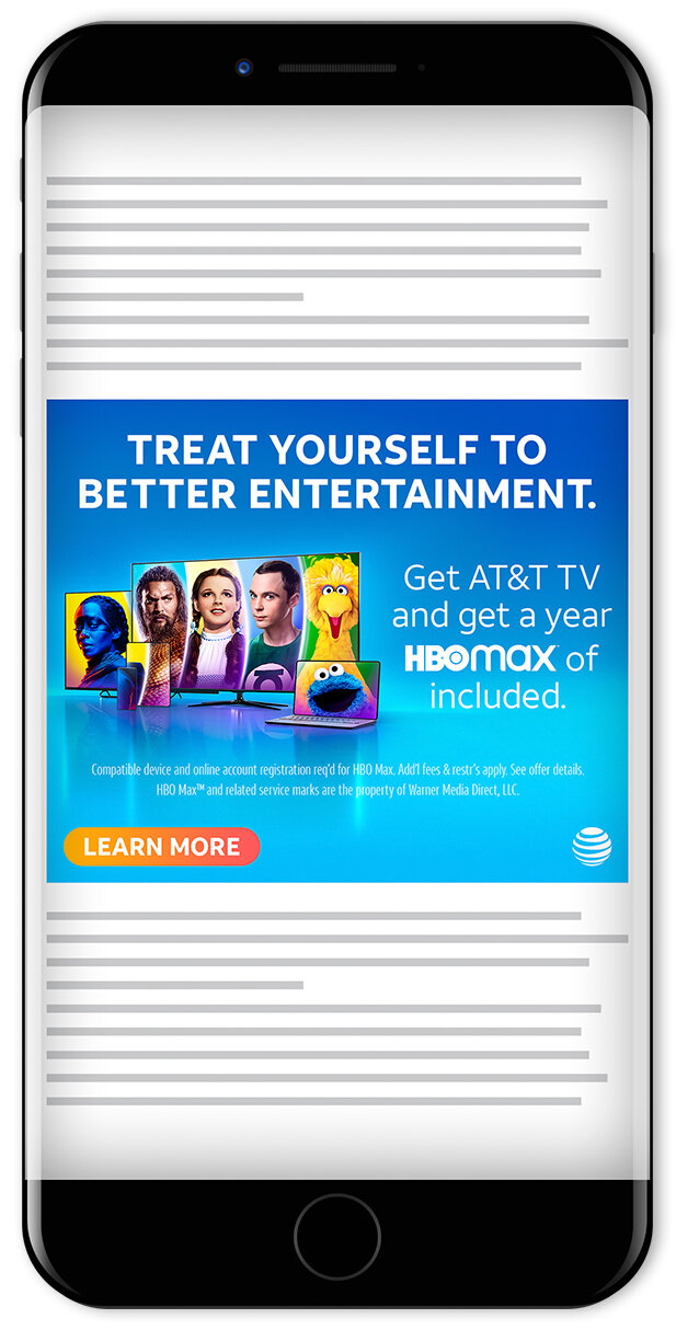
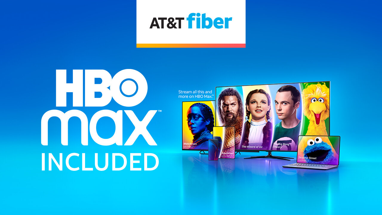
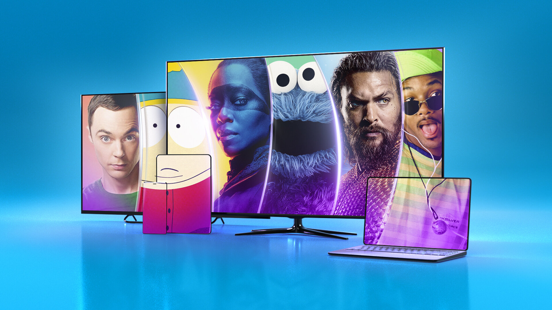
Key art design and campaign rollout for AT&T’s HBO Max bundle promotion.
CLIENT: AT&T, WarnerMedia ROLE: Art Direction, Design
CREATIVE DIRECTOR: Nicole Gunther ASSOCIATE CREATIVE DIRECTOR: Oliver Dudley, Nancy Jimenez
RETOUCHING/VFX SUPERVISOR: Billy Lewis RETOUCHING: Nina Marie
CATEGORY: Branding, Digital Advertising, Key Art, OOH Advertising, Print, Social
“Key art explorations and thumbnail sketches
”
NOTES
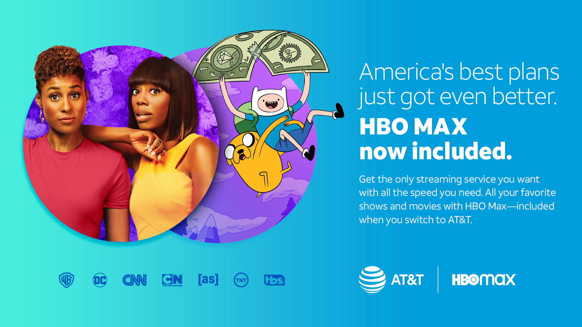
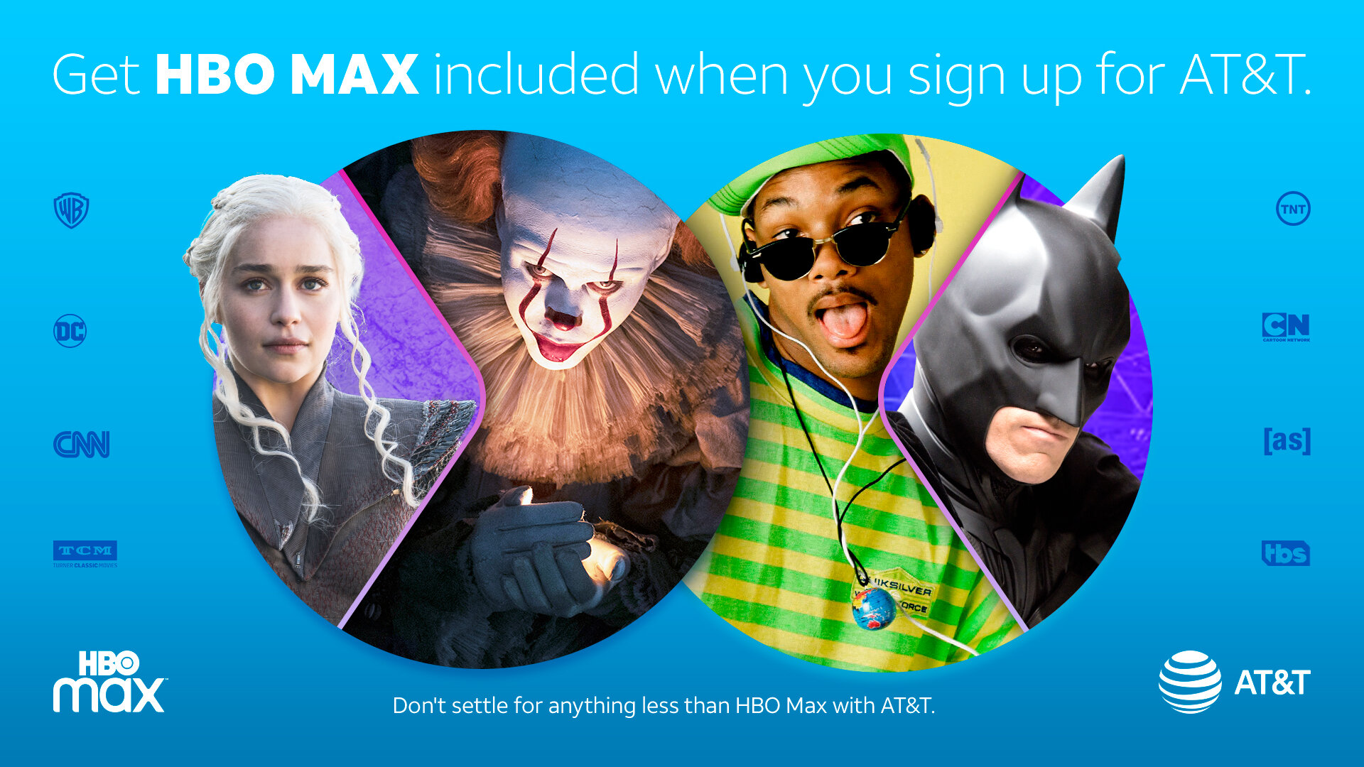
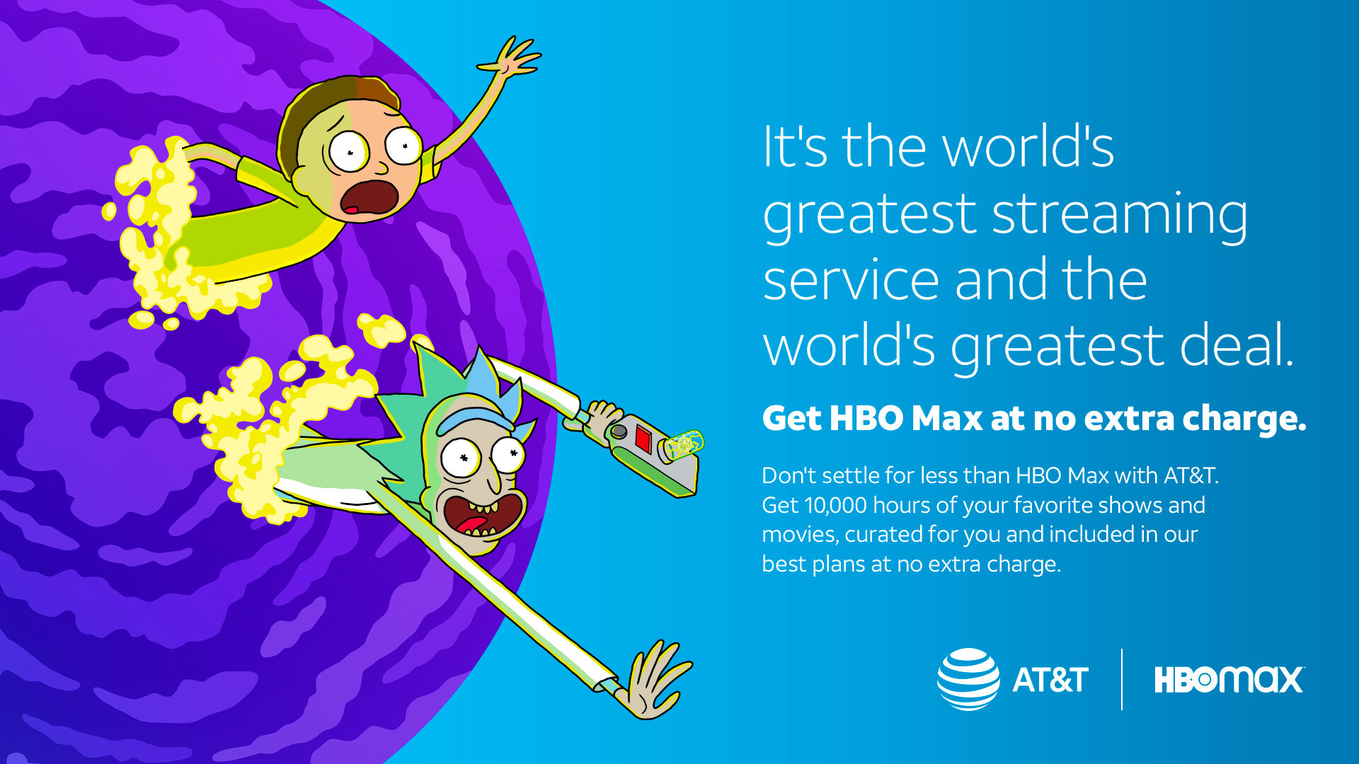
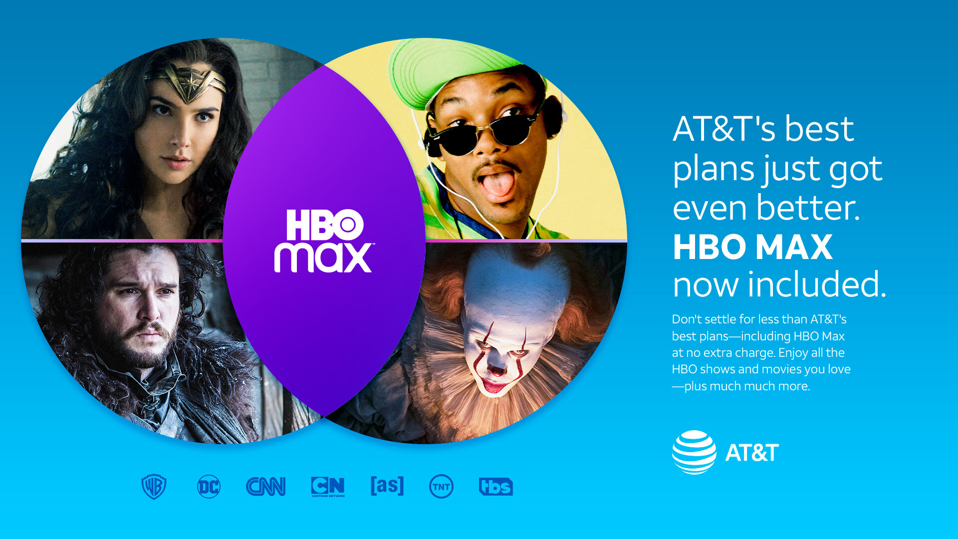
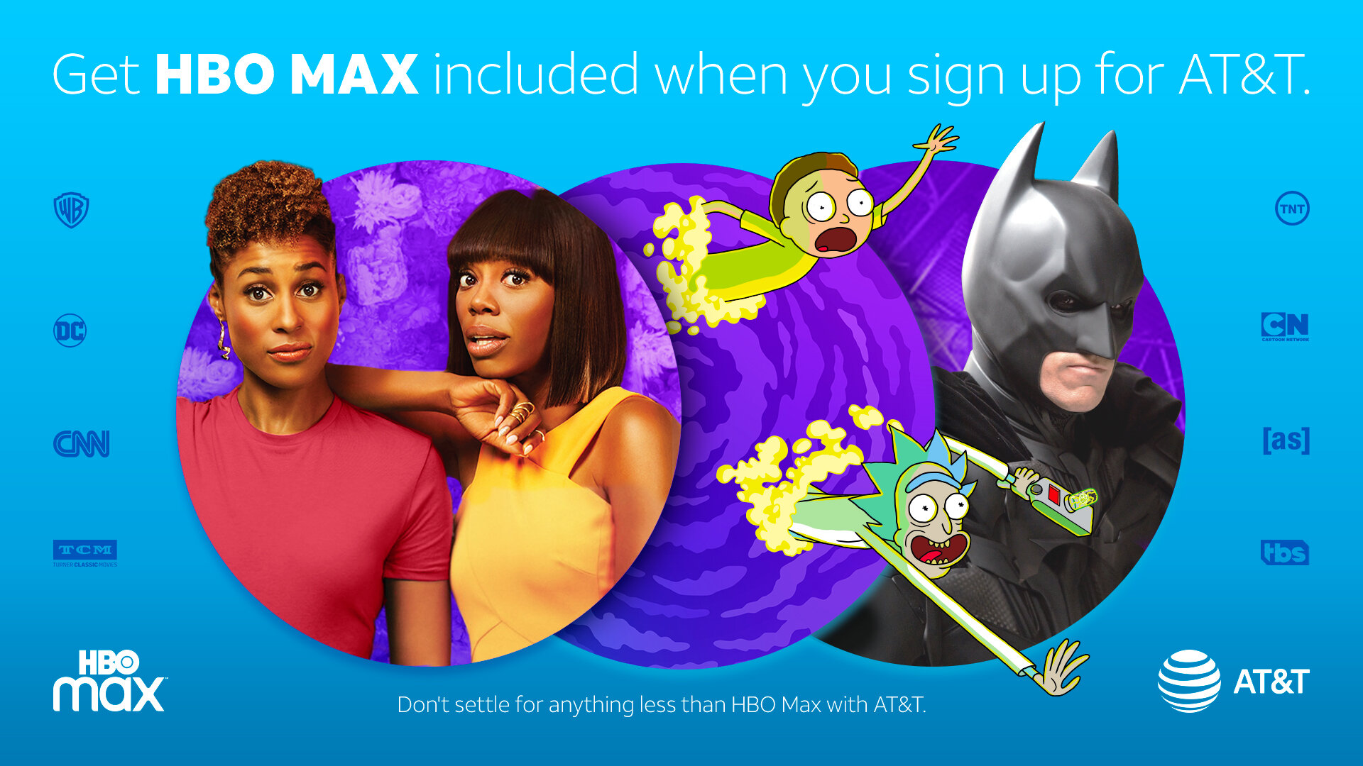
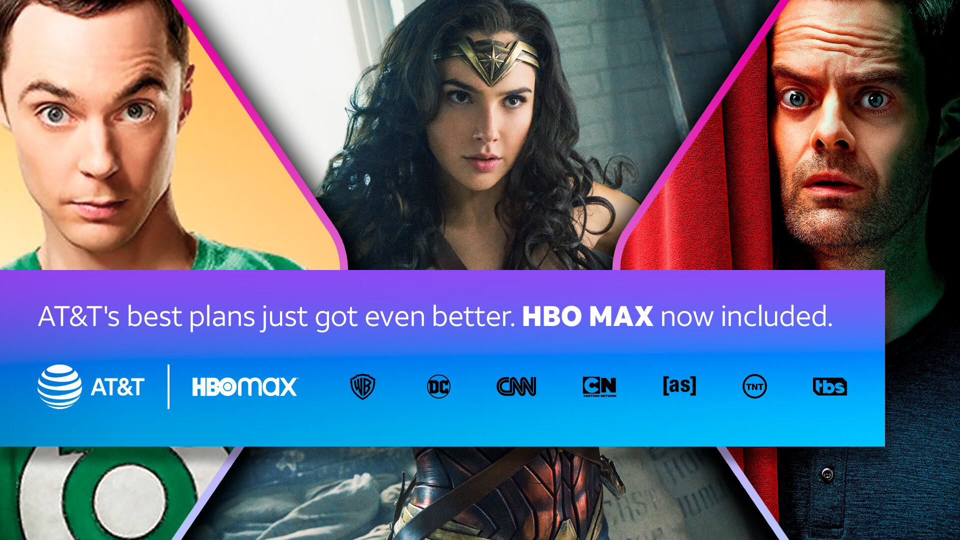
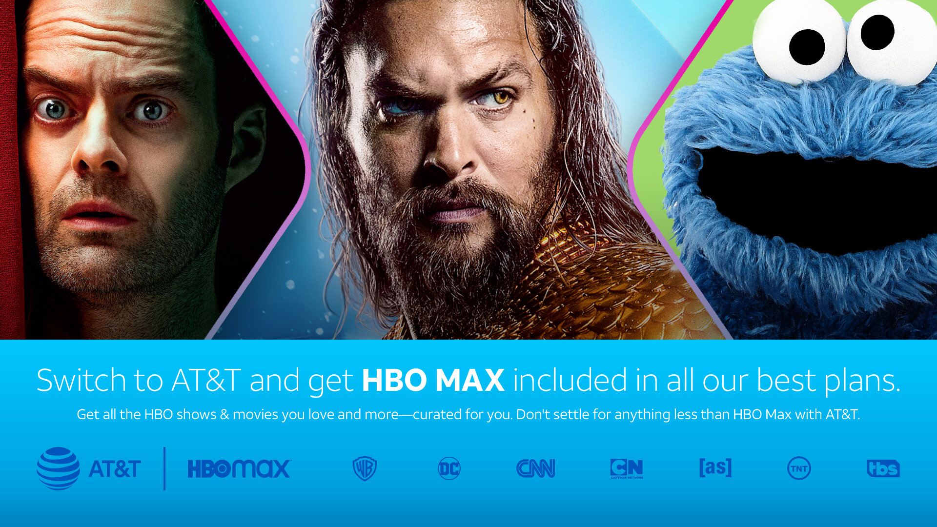
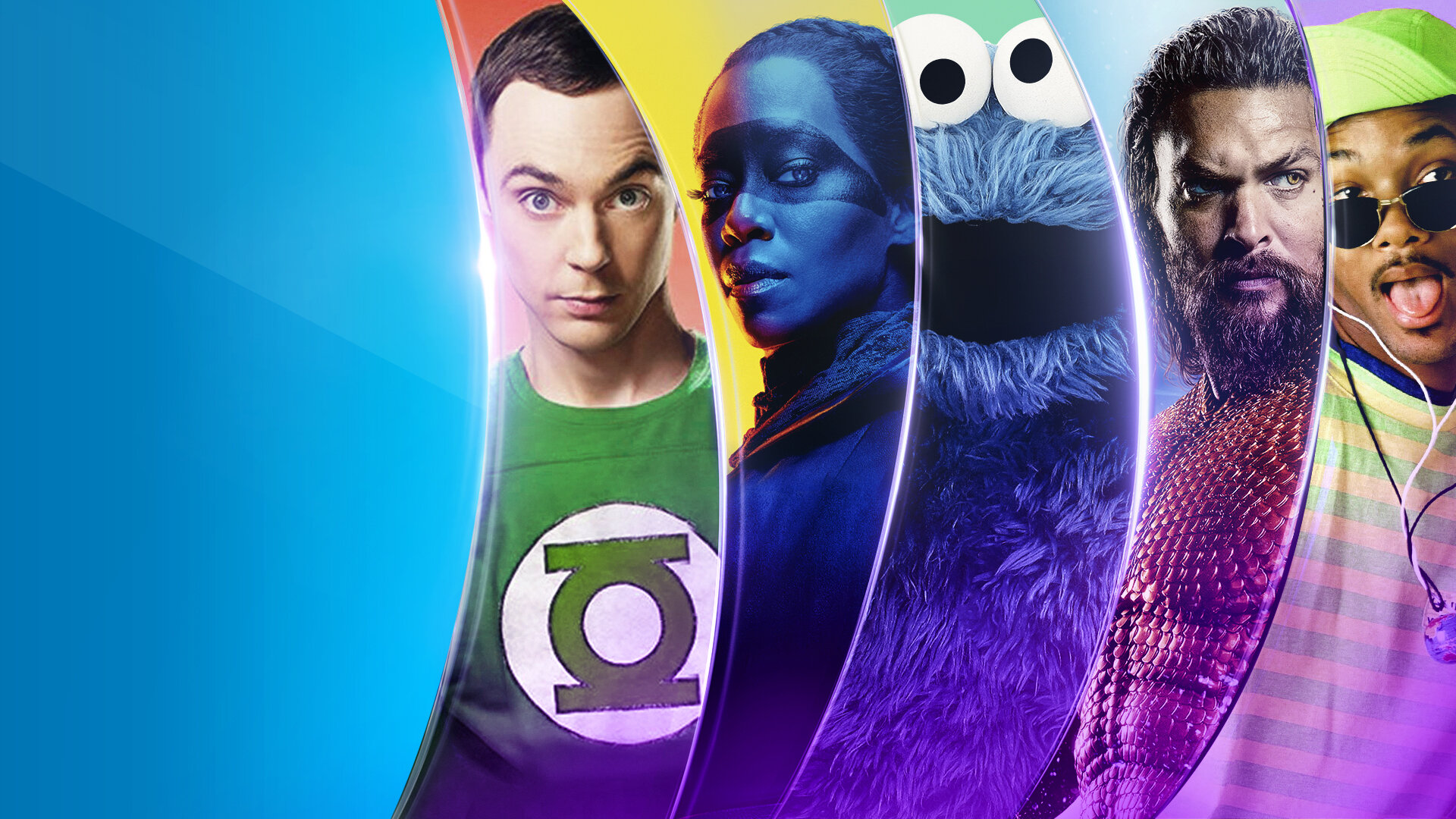
“Prior to the launch of HBO Max, AT&T offered bundled service plans which included a free subscription to HBO Max as a promotion and incentive. As this project was completed pre-launch of HBO Max, information on the look and feel of the new service was limited to non-existent. Conjecture drove how to marry the AT&T brand with the soon-to-be-launched HBO Max. Sketching led to the use of circles as a way to contain the familiar stars of HBO Max content. The circles reflected not only the two brands overlapping and “coming together” but also the AT&T logo mark. The palette breakdown leaned toward a dominant AT&T blue with the purple tones from HBO Max incorporated in accents. Feedback and development led to the “slices” replacing the circles as the content holders. A variation on the “slices” was housed in a composition of devices to highlight the options available to the consumer.
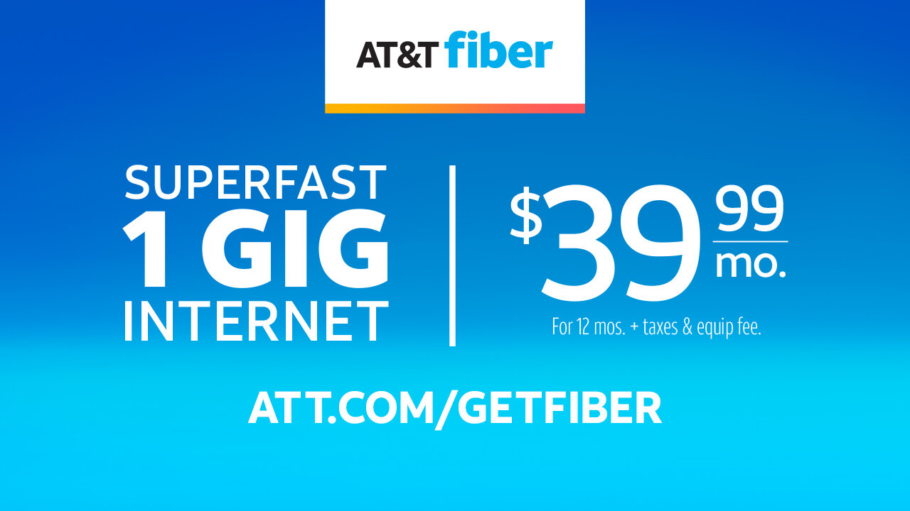
Once approved, the two designs were rolled out for a variety of purposes, including in-store posters, banner ads, social, flyers, postcards, and door hangers.”


